Introducing Our New Typeface: Kyoto
When most people think about watch design, they focus on the visible elements — the case, the dial, the movement, the bracelet. But one of the most subtle and powerful design decisions lies in something far smaller: typography.
The typeface used on a watch dial is a tiny detail. But it influences clarity, emotion, and identity. A well-chosen typeface can communicate precision, elegance, or modernity in ways that are almost invisible — yet deeply felt.
For this reason, typography has always been an essential component of the Emerton Scott design language.
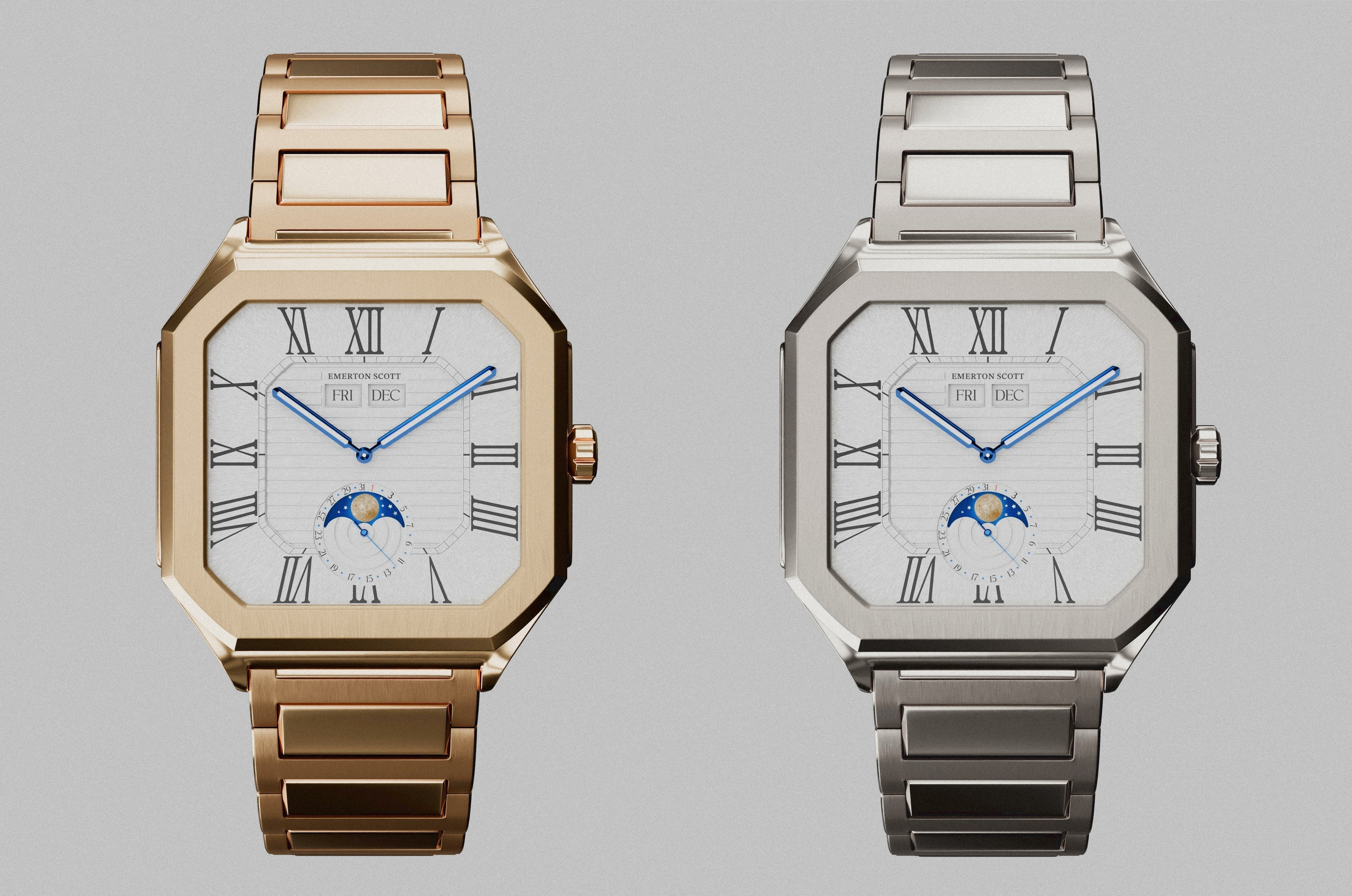
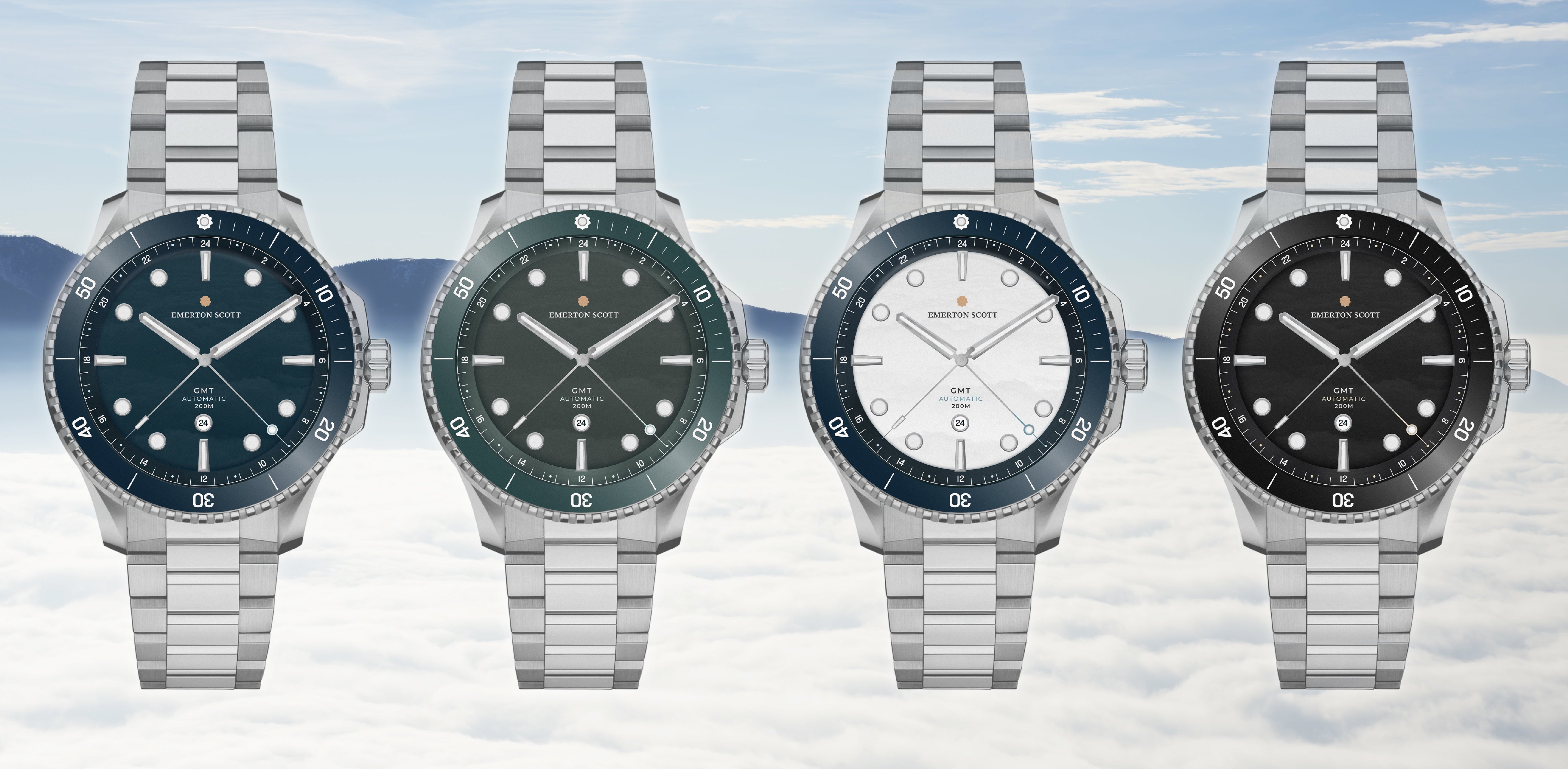
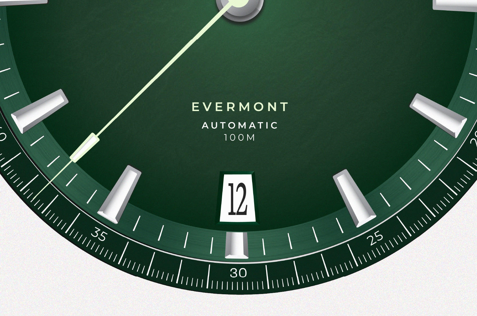
Originally, I designed a unique typeface for the Evermont which I really thought worked well.
But the time has come that we have to think about how our typefaces and other design language should work across all of our timepieces.
There has to be a consistancy, if we are going to plan for the longterm.
Which is why today, I'm proud to introduce Kyoto as the new typeface for Emerton Scott Timepieces.
This decision is the result of extensive exploration into what typography should represent for our brand in key areas of our watch dials, and how it can reflect the values that define everything we have built so far and will build in future.

Typography as a Design Instrument
Typography is often described as the voice of a brand. Just as architecture defines the character of a building, typography defines the tone of a visual identity.
For a watch company, this relationship becomes even more significant. Watches are instruments of precision, objects of engineering, and expressions of personal taste. The typography that accompanies them must therefore achieve a delicate balance:
• Clarity and legibility
• Refinement and personality
• Structure and restraint
Too rigid, and the design becomes cold.
Too expressive, and it loses the quiet confidence that defines timeless objects.
The ideal typeface exists somewhere between these extremes — structured, yet alive.
Kyoto embodies this balance beautifully.
The Philosophy Behind Kyoto
Kyoto was born from an exploration of the Japanese writing system, specifically the hiragana and katakana syllabaries.
Rather than imitating Japanese aesthetics, the typeface studies the deeper principles that define them: rhythm, balance, and the relationship between gesture and structure.
Japanese calligraphy is remarkable in that it combines expressive movement with disciplined form. Every stroke carries intention, yet no line feels mechanical. The result is a writing system that feels both controlled and fluid — precise yet human.
Kyoto captures this same spirit.
It builds a visual bridge between two fundamentally different writing systems: Japanese syllabaries and the Latin alphabet. Achieving this harmony required translating the expressive qualities of calligraphy into a typographic structure that could function across languages while maintaining a unified visual voice.
The result is a typeface that feels structured, yet quietly expressive — something we found deeply aligned with the philosophy behind Emerton Scott.

Where Structure Meets Expression
One of the defining characteristics of Kyoto is its slab serif structure.
Slab serifs are traditionally known for their solidity and strength. Historically used in signage and display typography, they project confidence and clarity through bold, grounded forms.
But Kyoto approaches this structure differently.
Instead of rigid geometry, the typeface introduces subtle curvature and calligraphic influence within its forms. This allows the letters to retain the stability of slab serifs while expressing the fluid rhythm found in Japanese writing.
This duality — strength paired with movement — resonated strongly with our approach to watchmaking.
Our watches follow the same philosophy:
• Strong architectural case structures
• Balanced dial compositions
• Mechanical precision inside
• Refined finishing and subtle details outside
Like Kyoto, they are built on structure, yet defined by nuance.
A Typeface Designed for Harmony
A crucial part of Kyoto’s design lies in how its characters interact.
The typeface was carefully refined to balance the expressive curves of certain letters with the weight of its distinctive serifs. Early versions experimented with exaggerated forms and heavy punctuation, pushing the boundaries of typographic convention.
Over time, the design evolved toward equilibrium — retaining its personality while ensuring visual comfort and clarity.
This balance is essential in typography, just as it is in watch design.
Every component must coexist within a coherent system.
No element should dominate unnecessarily.
Every detail must serve the whole.
Kyoto embodies this philosophy through its carefully controlled rhythm, spacing, and character proportions.
It is expressive without being loud.
Distinctive without becoming distracting.
Why Kyoto Is Perfect for Emerton Scott
When selecting a typeface for Emerton Scott, we looked for something that could reflect several core qualities of our brand:
Precision – Typography must feel engineered and intentional.
Timelessness – It should avoid trends and remain relevant for decades.
Character – The typeface must have personality without sacrificing clarity.
Versatility – It must function across print, digital environments, and physical products.
Kyoto satisfied each of these criteria.
Its structural foundation reflects the discipline of engineering.
Its calligraphic influence adds warmth and humanity.
Its balanced proportions ensure clarity in both display and text environments.
Perhaps most importantly, Kyoto possesses something difficult to quantify: presence.
It feels confident without needing to shout.
This quiet strength mirrors the character of our watches.
A Natural Evolution of Our Design Language
The introduction of Kyoto is not a reinvention of Emerton Scott. It is a refinement.
As our products evolve and our brand matures, our visual language must grow alongside it. Kyoto provides a typographic foundation capable of supporting that evolution for many years to come.
It reflects the same values that guide everything we design:
• Precision with purpose
• Timeless over trend
• Structure balanced with beauty
• Innovation guided by restraint
In many ways, the typeface feels less like a new addition and more like a natural extension of the philosophy we have always followed.
Looking Forward
Typography may seem like a small detail, but in design, the smallest details often carry the greatest meaning.
The choice of Kyoto represents our continued commitment to thoughtful design — where every decision, no matter how subtle, contributes to a cohesive and enduring identity.
Just as a well-crafted movement reveals its beauty through careful engineering, a great typeface reveals its character through careful design.
Kyoto now becomes part of the visual language of Emerton Scott.
And like every element we choose, it exists for one reason only:
To make every detail better.